What Is Color Contrast?

Color contrast is about how one color stands out from another color. It’s especially important to consider the color difference between text and the background, and between sections depicting meaning such as pie charts, maps, etc.

Here is an example showing how difficult it is to read text with insufficient contrast:
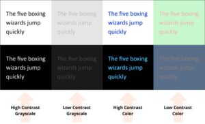
The same sentence in high and low contrast colors

Most people prefer good contrast – it’s easier for everyone to read. But poor contrast especially impacts people with low vision and with color blindness.

Color Contrast Guidelines

  • Use a contrast checking tool. Check out the color contrast checkers section for more information.
  • Choose a color scheme that provides high contrast between the text and the background. If you have a dark background, the text should be light, and vice versa (black and white provide maximum contrast).
  • Avoid the following color combinations:
    • Green and red (or related colors)
    • Blue and yellow (or related colors)
  • Use larger text and simple (not ornate) fonts. Sans serif fonts are preferable.
  • Don’t rely on color as the sole means of conveying information. For example, don’t use color as your only method of indicating heading levels.
  • Use bold instead of color for emphasis.
  • Text can be difficult to read on photographic or gradient backgrounds. Set text against a solid background when possible.

Brand Colors

CSU’s Brand colors are designed with accessibility in mind. The Brand includes approved color combinations for various text and background colors. These are the only approved color combinations in the CSU Brand, determined after extensive accessibility testing. This takes the guesswork out of choosing text and background colors.

Visit the CSU Brand Color website and look for the “Color Pairings for Accessibility” section. Any color combination that says “AA18” means it passes accessibility requirements only if the text is size 18pt or larger.

Color Contrast Checkers

There are many color contrast tools available. Here are a few that we recommend, but you may use others as long as they check against WCAG standards. Our minimum goal is to meet level AA standards.

Video: Using the Colour Contrast Analyser

Written Instructions

The Colour Contrast Analyser (CCA) is free and available for both Mac and PC.

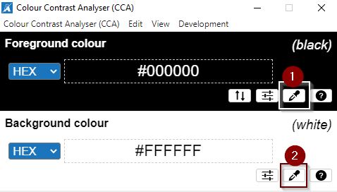
  1. Once downloaded, use the eyedropper to select your foreground and background colors. CCA Eyedropper icons for foreground and background colour
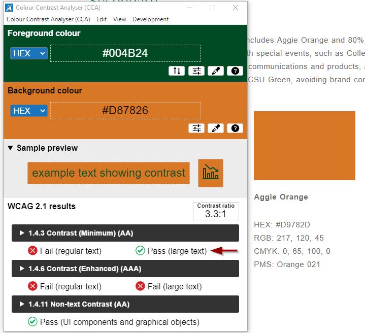
  2. Check the results against WCAG level AA standards. Text is considered large if it is 18pt and larger, or 14pt and larger if it is bold. In this case, the orange and green only pass AA for large text: CCA Tool showing regular text failing contrast
The WebAIM Contrast Checker is a web-based tool that does not require installation. It can check for contrast anywhere on your screen.

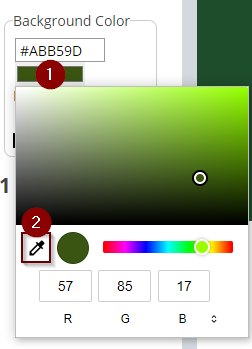
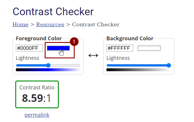
  1. If you don’t know the color codes, this checker has an eyedropper tool. Click on the current color to access the eyedropper tool. In the WebAIM contrast checker, click on the foreground color
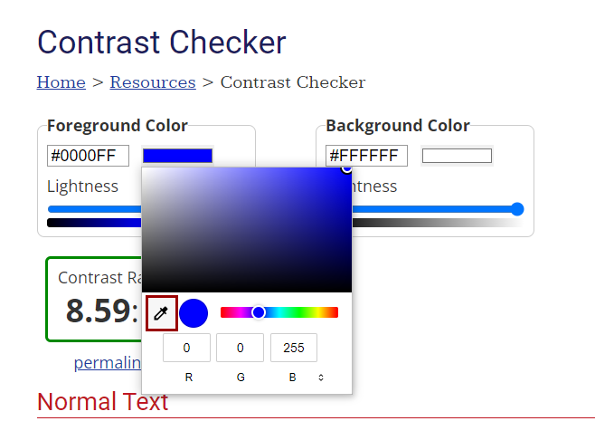
  2. Use the eyedropper tool to select the foreground color. Repeat these steps with the background color. Eyedropper tool in the WebAIM contrast checker
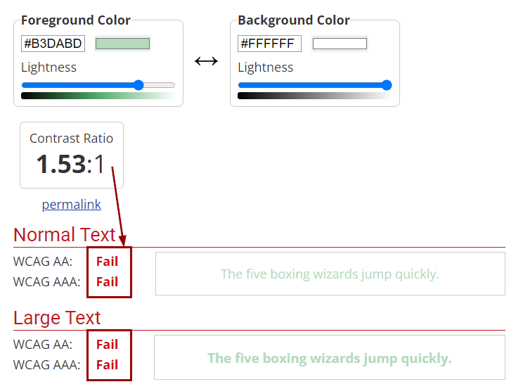
  3. Check the results against WCAG level AA standards.Failed colors in the WebAIM contrast checker
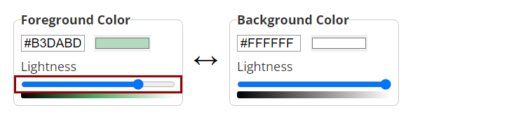
  4. If contrast fails, The WebAIM Checker goes the extra step of helping you find a similar color that does have sufficient contrast. Drag the slider to find a color that passes. Drag slider to increase the contrast

The WAVE Tool is a free Chrome extension that has a color contrast checker included. This tool only checks content within a browser.

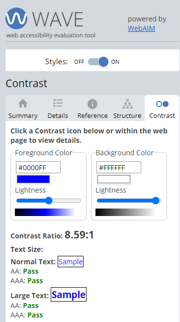
  1. Check the results against WCAG level AA standards. WAVE Tool Contrast Tab
You can use the eyedropper tool to check contrast both in and outside of the browser.

  1. Click on the color to input RGB codes or select the eyedropper tool. WAVE Eyedropper tool