


Accessibility by Design Accessibility by Design Inclusive Electronic and Information Technology
This site is a central point for all information regarding electronic accessibility at Colorado State University. The site is produced by the Assistive Technology Resource Center.
Learn What To Do
Standards and Community
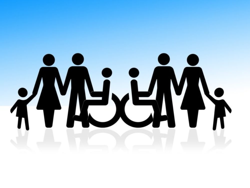
Why Electronic Inclusion Matters


-
19.4% of Students in higher education have a disability
-
8.5% of Adults use assistive technology
-
1 in 4 Adults has a disability